
-
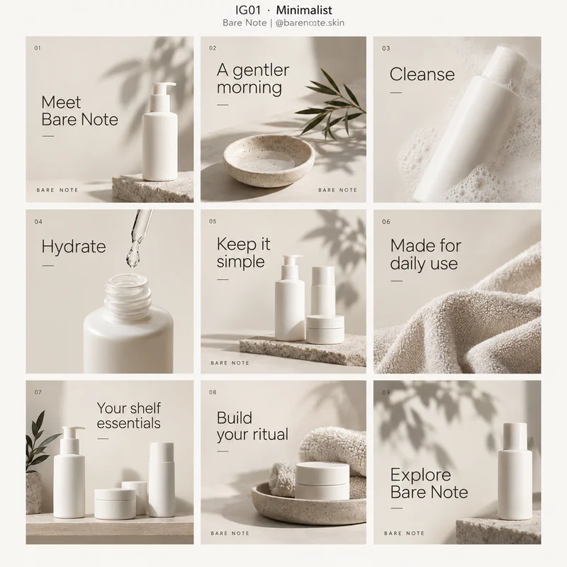 IG01
IG01Minimalist
Uses generous empty space, a small neutral palette, simple type, and a few carefully placed objects.
Best for Skincare, personal care, and quiet premium brands.
Grid details and style keywords
Bare Note · Skincare brand · @barenote.skinfictional example
Keep one idea on each slide. Repeat margins and type sizes, and let product images carry the quieter slides.
- negative space
- restrained palette
- thin rules
- simple sans serif
- soft daylight
- 1Meet Bare Note
- 2A gentler morning
- 3Cleanse
- 4Hydrate
- 5Keep it simple
- 6Made for daily use
- 7Your shelf essentials
- 8Build your ritual
- 9Explore Bare Note
-
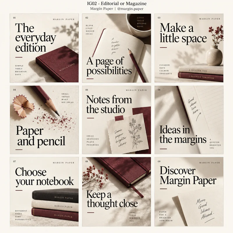 IG02
IG02Editorial or Magazine
Borrows magazine typography and art direction, pairing expressive serif headlines with image crops, captions, and deliberate changes of scale.
Best for Stationery, publishing, fashion, and thoughtful lifestyle content.
Grid details and style keywords
Margin Paper · Stationery company · @margin.paperfictional example
Treat the cover like a magazine front page. Continue with photo spreads, short commentary, and a neatly composed closing slide.
- serif headlines
- editorial crops
- small captions
- typographic hierarchy
- art direction
- 1The everyday edition
- 2A page of possibilities
- 3Make a little space
- 4Paper and pencil
- 5Notes from the studio
- 6Ideas in the margins
- 7Choose your notebook
- 8Keep a thought close
- 9Discover Margin Paper
-
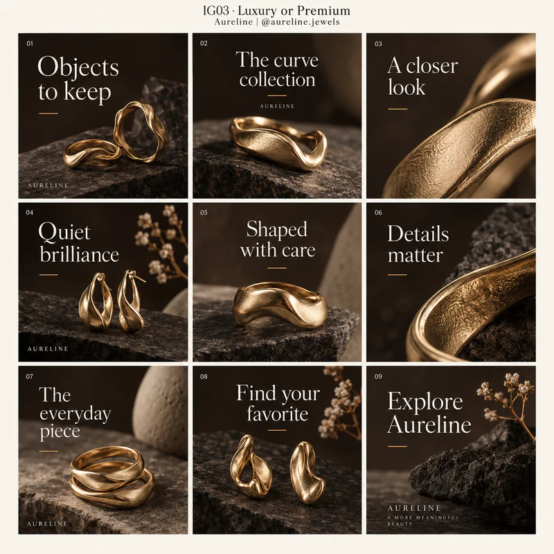 IG03
IG03Luxury or Premium
Uses restrained colors, refined type, considered spacing, and carefully lit imagery to emphasize materials and detail.
Best for Jewelry, high-end accessories, fragrance, and premium hospitality.
Grid details and style keywords
Aureline · Jewelry atelier · @aureline.jewelsfictional example
Open with one strong product image and a short headline. Give craftsmanship and material details their own slides.
- refined serif
- understated branding
- deep neutrals
- metallic accents
- macro detail
- 1Objects to keep
- 2The curve collection
- 3A closer look
- 4Quiet brilliance
- 5Shaped with care
- 6Details matter
- 7The everyday piece
- 8Find your favorite
- 9Explore Aureline
-
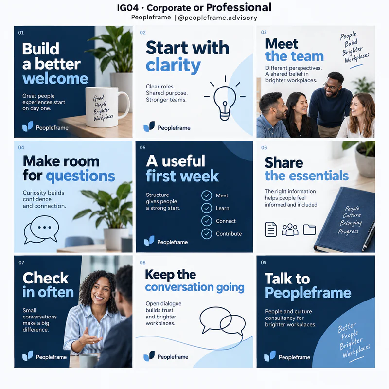 IG04
IG04Corporate or Professional
Builds a consistent business identity through disciplined alignment, clear typography, a restrained palette, and purposeful imagery.
Best for Consultancies, business services, recruitment, and professional education.
Grid details and style keywords
Peopleframe · People and culture consultancy · @peopleframe.advisoryfictional example
Use clear cover statements, short supporting points, and consistent section labels. Keep the same visual hierarchy throughout the sequence.
- navy palette
- clear hierarchy
- aligned blocks
- business photography
- simple icons
- 1Build a better welcome
- 2Start with clarity
- 3Meet the team
- 4Make room for questions
- 5A useful first week
- 6Share the essentials
- 7Check in often
- 8Keep the conversation going
- 9Talk to Peopleframe
-
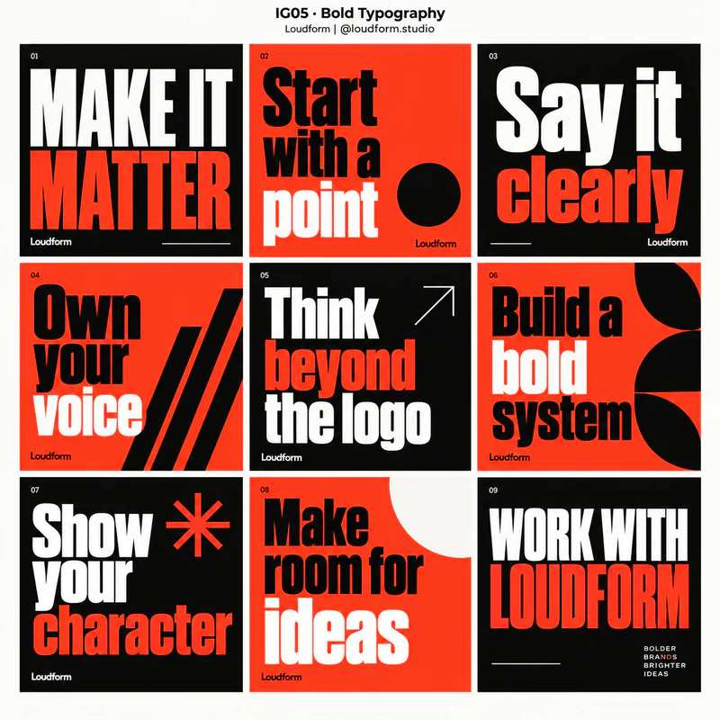 IG05
IG05Bold Typography
Makes oversized lettering, strong contrasts, and assertive typographic arrangements the main visual attraction.
Best for Creative agencies, campaigns, announcements, and confident personal brands.
Grid details and style keywords
Loudform · Branding studio · @loudform.studiofictional example
Keep headlines short enough to remain large. Change scale and placement to maintain interest while preserving a consistent type system.
- oversized type
- condensed display
- high contrast
- dramatic scale
- punchy copy
- 1MAKE IT MATTER
- 2Start with a point
- 3Say it clearly
- 4Own your voice
- 5Think beyond the logo
- 6Build a bold system
- 7Show your character
- 8Make room for ideas
- 9WORK WITH LOUDFORM
-
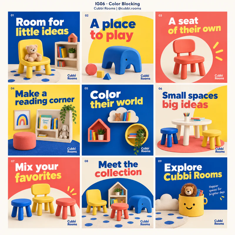 IG06
IG06Color Blocking
Organizes the composition with large, clearly separated areas of solid color, often using simple shapes and strong contrast.
Best for Children's products, retail launches, homeware, and approachable consumer brands.
Grid details and style keywords
Cubbi Rooms · Children's furniture company · @cubbi.roomsfictional example
Repeat a small color set across slides. Give each slide one dominant block and place text where contrast is strongest.
- solid color fields
- geometric blocks
- contrasting panels
- clean edges
- simple shapes
- 1Room for little ideas
- 2A place to play
- 3A seat of their own
- 4Make a reading corner
- 5Color their world
- 6Small spaces big ideas
- 7Mix your favorites
- 8Meet the collection
- 9Explore Cubbi Rooms
-
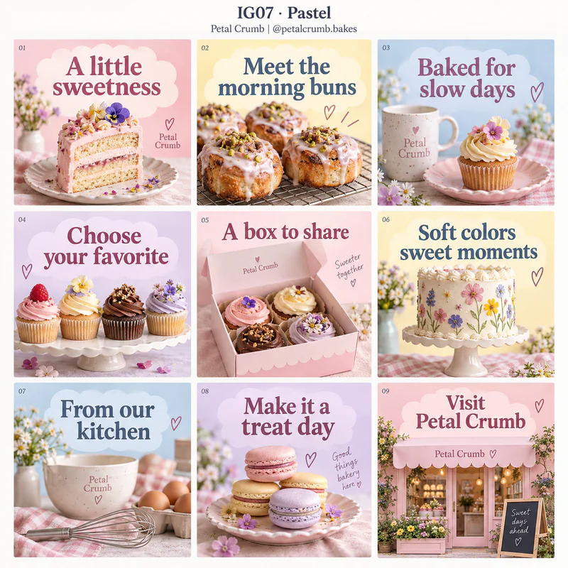 IG07
IG07Pastel
Uses light, softly tinted colors, gentle shapes, and friendly typography to create an approachable visual mood.
Best for Bakeries, gifting, beauty, baby products, and light lifestyle content.
Grid details and style keywords
Petal Crumb · Boutique bakery · @petalcrumb.bakesfictional example
Use a darker text color for readability. Alternate product imagery with short text slides and keep the pastel palette consistent.
- blush pink
- powder blue
- soft lavender
- rounded shapes
- gentle lighting
- 1A little sweetness
- 2Meet the morning buns
- 3Baked for slow days
- 4Choose your favorite
- 5A box to share
- 6Soft colors sweet moments
- 7From our kitchen
- 8Make it a treat day
- 9Visit Petal Crumb
-
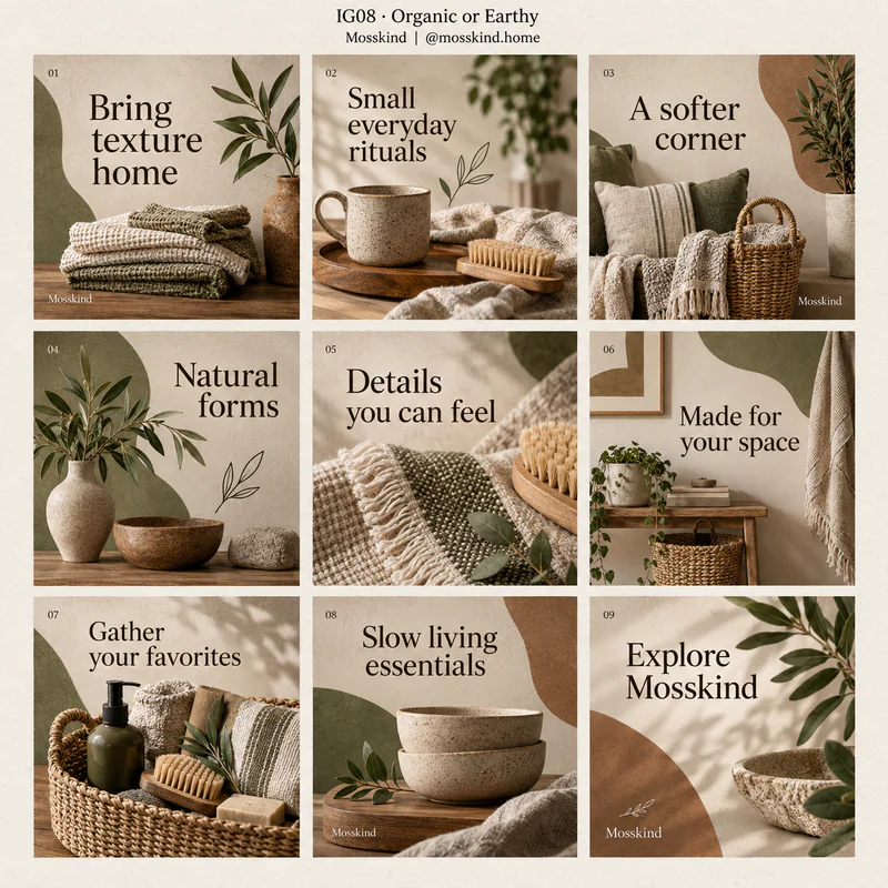 IG08
IG08Organic or Earthy
Combines muted natural colors, tactile materials, soft irregular forms, and nature-led imagery.
Best for Homeware, gardening, wellness, and brands centered on natural materials.
Grid details and style keywords
Mosskind · Home essentials shop · @mosskind.homefictional example
Repeat earthy colors and material textures. Use close details between wider lifestyle images to make the sequence feel tactile.
- earth tones
- paper texture
- botanical details
- irregular shapes
- natural light
- 1Bring texture home
- 2Small everyday rituals
- 3A softer corner
- 4Natural forms
- 5Details you can feel
- 6Made for your space
- 7Gather your favorites
- 8Slow living essentials
- 9Explore Mosskind
-
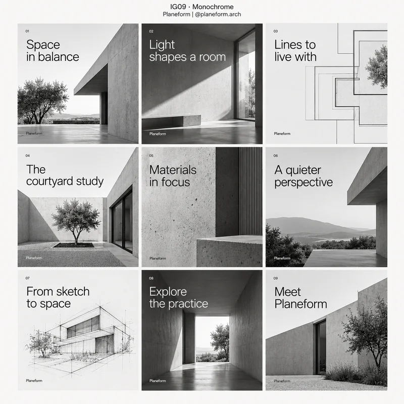 IG09
IG09Monochrome
Uses one hue or a black-to-white tonal range, relying on contrast, form, and typography instead of multiple colors.
Best for Architecture, art, fashion, and restrained visual identities.
Grid details and style keywords
Planeform · Architecture practice · @planeform.archfictional example
Vary light and dark backgrounds to establish rhythm. Keep one consistent tonal treatment for photos and text.
- black and white
- tonal contrast
- grayscale photography
- strong form
- limited palette
- 1Space in balance
- 2Light shapes a room
- 3Lines to live with
- 4The courtyard study
- 5Materials in focus
- 6A quieter perspective
- 7From sketch to space
- 8Explore the practice
- 9Meet Planeform
-
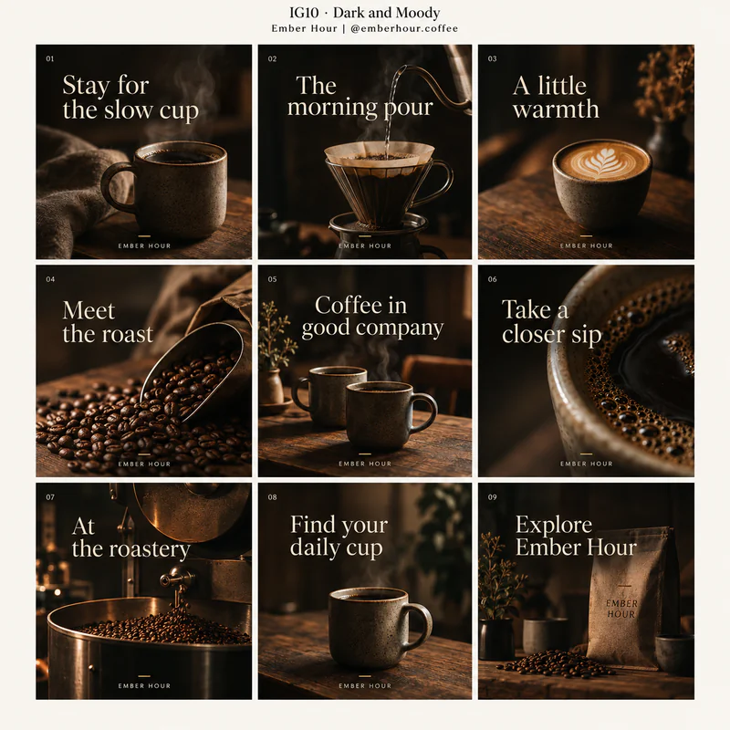 IG10
IG10Dark and Moody
Uses low-key lighting, deep shadows, rich dark colors, and selective highlights to create atmosphere.
Best for Coffee, restaurants, leather goods, nightlife, and atmospheric lifestyle brands.
Grid details and style keywords
Ember Hour · Specialty coffee roaster · @emberhour.coffeefictional example
Keep headlines bright and concise. Alternate moody close-ups with calm text slides so the sequence stays legible.
- low-key lighting
- deep shadows
- rich browns
- selective highlights
- tactile detail
- 1Stay for the slow cup
- 2The morning pour
- 3A little warmth
- 4Meet the roast
- 5Coffee in good company
- 6Take a closer sip
- 7At the roastery
- 8Find your daily cup
- 9Explore Ember Hour
-
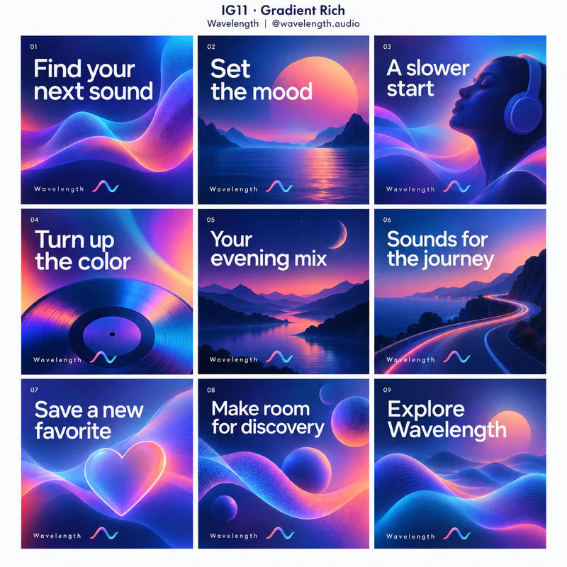 IG11
IG11Gradient Rich
Uses smooth transitions between colors as a major part of the identity, across backgrounds, type, and abstract graphics.
Best for Digital products, entertainment, creative platforms, and launches.
Grid details and style keywords
Wavelength · Music discovery app · @wavelength.audiofictional example
Carry the same gradient family across slides. Place text over calm areas, and use flatter backgrounds when a slide needs more explanation.
- mesh gradient
- luminous color
- smooth transitions
- flowing shapes
- clean type
- 1Find your next sound
- 2Set the mood
- 3A slower start
- 4Turn up the color
- 5Your evening mix
- 6Sounds for the journey
- 7Save a new favorite
- 8Make room for discovery
- 9Explore Wavelength
-
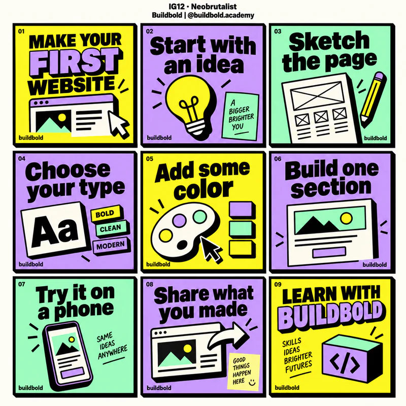 IG12
IG12Neobrutalist
Uses thick outlines, flat vivid colors, chunky type, and hard offset shadows to make components feel direct and graphic.
Best for Creator tools, online learning, independent products, and expressive startups.
Grid details and style keywords
Buildbold · Coding education platform · @buildbold.academyfictional example
Build repeatable bordered panels with a clear headline and short content. Use color changes and graphic stickers to mark the sequence.
- thick black borders
- hard shadows
- flat colors
- chunky type
- boxed components
- 1MAKE YOUR FIRST WEBSITE
- 2Start with an idea
- 3Sketch the page
- 4Choose your type
- 5Add some color
- 6Build one section
- 7Try it on a phone
- 8Share what you made
- 9LEARN WITH BUILDBOLD
-
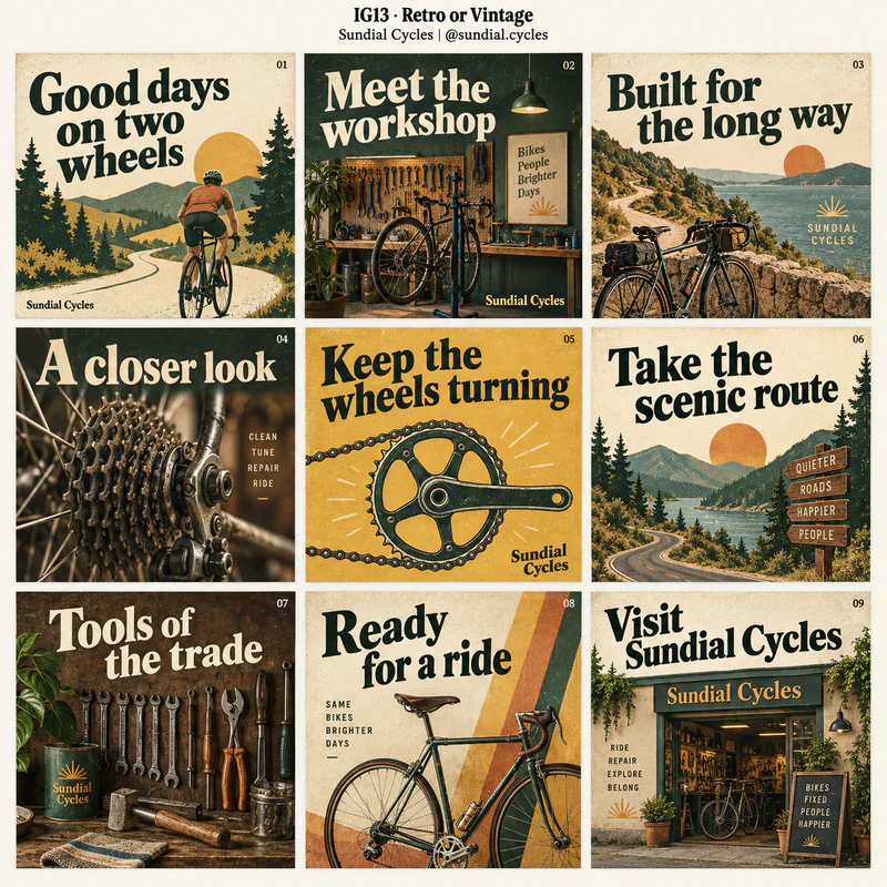 IG13
IG13Retro or Vintage
References older print design through period lettering, muted inks, grain, badges, and nostalgic illustration or photography.
Best for Coffee shops, repair businesses, heritage-inspired retail, and nostalgic campaigns.
Grid details and style keywords
Sundial Cycles · Bicycle repair workshop · @sundial.cyclesfictional example
Keep one recognizable era and palette. Mix poster-like covers, detail images, and period-inspired labels across the carousel.
- vintage serif
- faded ink
- print grain
- retro badges
- warm muted colors
- 1Good days on two wheels
- 2Meet the workshop
- 3Built for the long way
- 4A closer look
- 5Keep the wheels turning
- 6Take the scenic route
- 7Tools of the trade
- 8Ready for a ride
- 9Visit Sundial Cycles
-
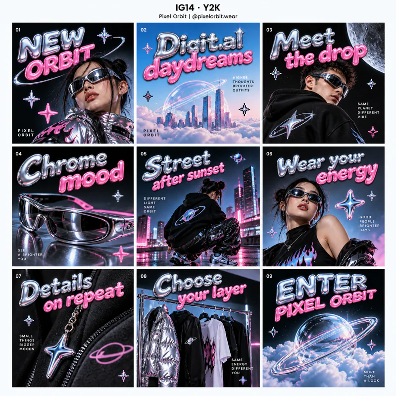 IG14
IG14Y2K
Draws on late-1990s and early-2000s digital pop culture with chrome, glossy effects, bright colors, and playful digital motifs.
Best for Streetwear, beauty launches, music culture, and youth-oriented campaigns.
Grid details and style keywords
Pixel Orbit · Streetwear label · @pixelorbit.wearfictional example
Use metallic or glossy treatments for short headlines. Keep body copy on clear flat areas, and repeat a few recognizable motifs.
- chrome type
- glossy shapes
- bubble lettering
- pixel motifs
- digital nostalgia
- 1NEW ORBIT
- 2Digital daydreams
- 3Meet the drop
- 4Chrome mood
- 5Street after sunset
- 6Wear your energy
- 7Details on repeat
- 8Choose your layer
- 9ENTER PIXEL ORBIT
-
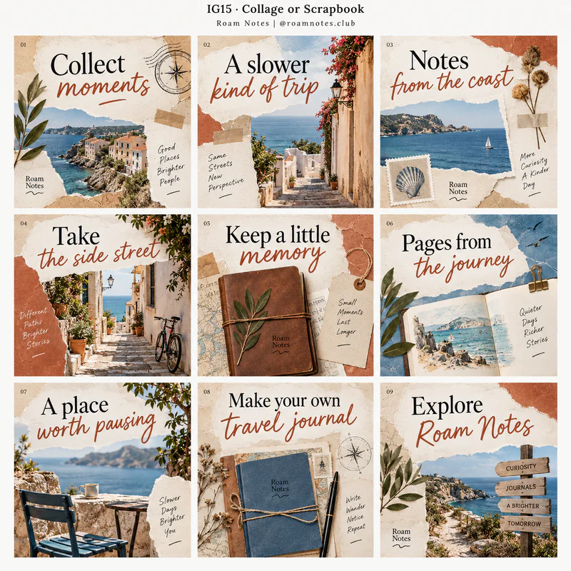 IG15
IG15Collage or Scrapbook
Layers cutout images, torn edges, tape, handwritten notes, and paper fragments to create a collected, personal composition.
Best for Travel, creative communities, lifestyle storytelling, and handmade businesses.
Grid details and style keywords
Roam Notes · Travel journal publisher · @roamnotes.clubfictional example
Give every slide a clear focal point beneath the layers. Repeat paper textures and annotations to tie the story together.
- torn paper
- cutout photography
- tape details
- layered textures
- handwritten notes
- 1Collect moments
- 2A slower kind of trip
- 3Notes from the coast
- 4Take the side street
- 5Keep a little memory
- 6Pages from the journey
- 7A place worth pausing
- 8Make your own travel journal
- 9Explore Roam Notes
-
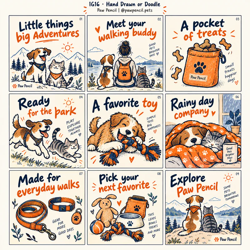 IG16
IG16Hand Drawn or Doodle
Uses visible pen strokes, playful sketches, handwritten accents, and imperfect marks to create a personal illustration style.
Best for Pet brands, small businesses, creative education, and friendly service accounts.
Grid details and style keywords
Paw Pencil · Pet accessories shop · @pawpencil.petsfictional example
Keep headings easy to read and let doodles explain or emphasize one point. Reuse a small set of characters and line treatments.
- hand-drawn lines
- doodle icons
- handwritten accents
- sketch texture
- playful marks
- 1Little things big adventures
- 2Meet your walking buddy
- 3A pocket of treats
- 4Ready for the park
- 5A favorite toy
- 6Rainy day company
- 7Made for everyday walks
- 8Pick your next favorite
- 9Explore Paw Pencil
-
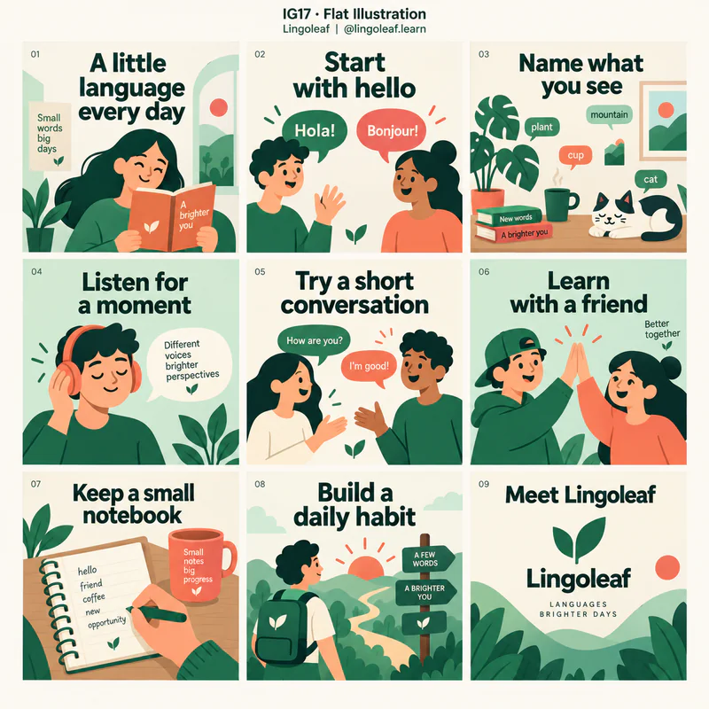 IG17
IG17Flat Illustration
Uses simplified two-dimensional characters, objects, and scenes with solid fills and little or no rendered depth.
Best for Learning, community projects, software explainers, and approachable services.
Grid details and style keywords
Lingoleaf · Language learning studio · @lingoleaf.learnfictional example
Use one illustrated scene or metaphor per slide. Keep character proportions, outlines, and colors consistent through the story.
- flat vector illustration
- solid fills
- simplified characters
- clean outlines
- visual metaphors
- 1A little language every day
- 2Start with hello
- 3Name what you see
- 4Listen for a moment
- 5Try a short conversation
- 6Learn with a friend
- 7Keep a small notebook
- 8Build a daily habit
- 9Meet Lingoleaf
-
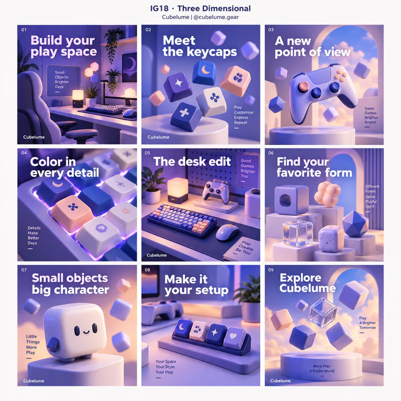 IG18
IG18Three Dimensional
Makes rendered objects, materials, depth, and lighting central to the visual identity.
Best for Technology accessories, gaming, product launches, and imaginative campaigns.
Grid details and style keywords
Cubelume · Gaming accessories maker · @cubelume.gearfictional example
Repeat the same rendered object or material family from different viewpoints. Keep type in a simple consistent layer over clear space.
- 3D render
- volumetric forms
- tactile materials
- soft shadows
- studio lighting
- 1Build your play space
- 2Meet the keycaps
- 3A new point of view
- 4Color in every detail
- 5The desk edit
- 6Find your favorite form
- 7Small objects big character
- 8Make it your setup
- 9Explore Cubelume
-
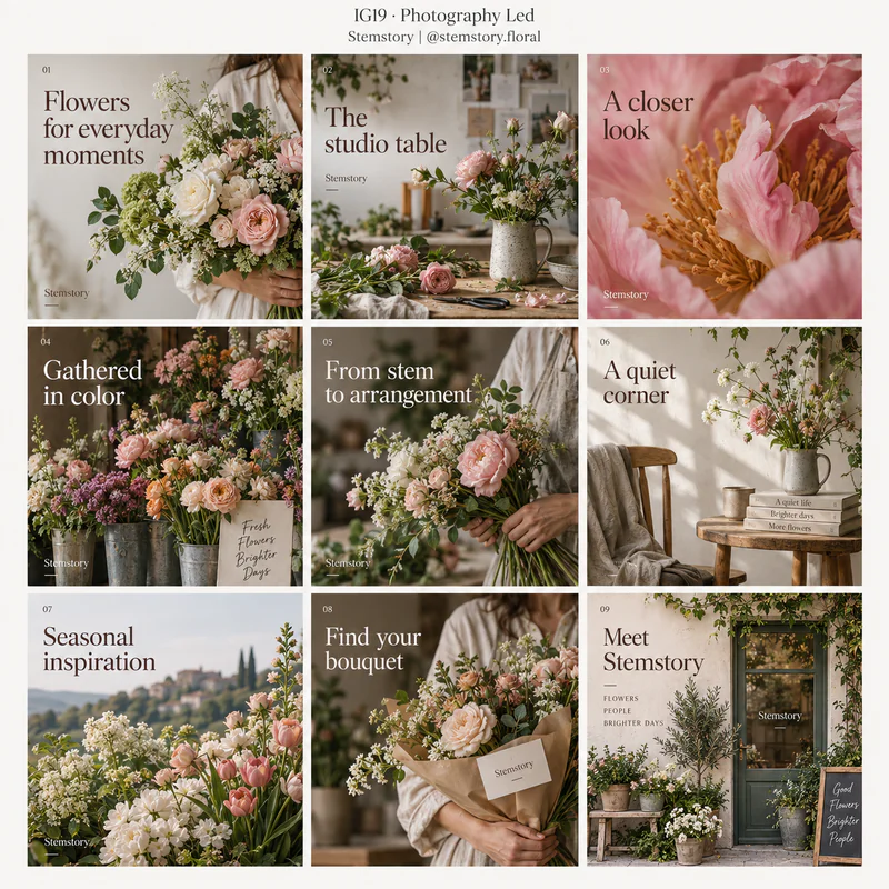 IG19
IG19Photography Led
Lets strong images carry most of the communication, using restrained text and consistent photographic treatment.
Best for Florists, travel, hospitality, fashion, and portfolio accounts.
Grid details and style keywords
Stemstory · Floral design studio · @stemstory.floralfictional example
Sequence wide scenes, medium compositions, and close details. Keep text overlays short and placed away from important subjects.
- full-frame photography
- consistent color grade
- image storytelling
- minimal overlays
- natural detail
- 1Flowers for everyday moments
- 2The studio table
- 3A closer look
- 4Gathered in color
- 5From stem to arrangement
- 6A quiet corner
- 7Seasonal inspiration
- 8Find your bouquet
- 9Meet Stemstory
-
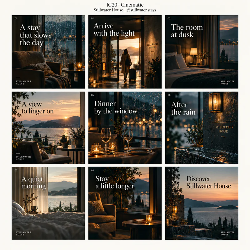 IG20
IG20Cinematic
Uses dramatic framing, directed light, atmospheric color grading, and image sequences that suggest a film narrative.
Best for Hospitality, destinations, experiences, film accounts, and brand storytelling.
Grid details and style keywords
Stillwater House · Boutique hotel · @stillwater.staysfictional example
Plan a sequence of establishing views and intimate details. Keep the same lighting mood and color grade from cover to closing slide.
- cinematic framing
- directed light
- film grain
- atmospheric grade
- visual sequence
- 1A stay that slows the day
- 2Arrive with the light
- 3The room at dusk
- 4A view to linger on
- 5Dinner by the window
- 6After the rain
- 7A quiet morning
- 8Stay a little longer
- 9Discover Stillwater House
-
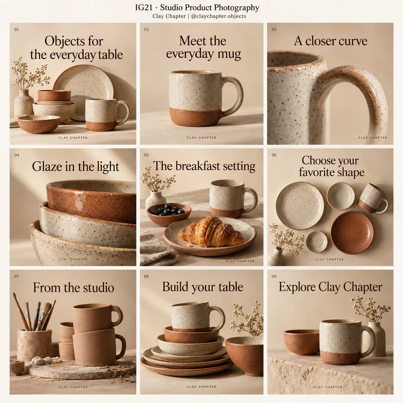 IG21
IG21Studio Product Photography
Centers products through controlled lighting, purposeful backgrounds, careful arrangement, and visible material detail.
Best for Ceramics, cosmetics, food packaging, accessories, and ecommerce brands.
Grid details and style keywords
Clay Chapter · Ceramics workshop · @claychapter.objectsfictional example
Alternate product hero views, close details, and grouped arrangements. Keep lighting direction and background colors consistent.
- seamless backdrop
- controlled light
- product hero
- material close-up
- styled still life
- 1Objects for the everyday table
- 2Meet the everyday mug
- 3A closer curve
- 4Glaze in the light
- 5The breakfast setting
- 6Choose your favorite shape
- 7From the studio
- 8Build your table
- 9Explore Clay Chapter
-
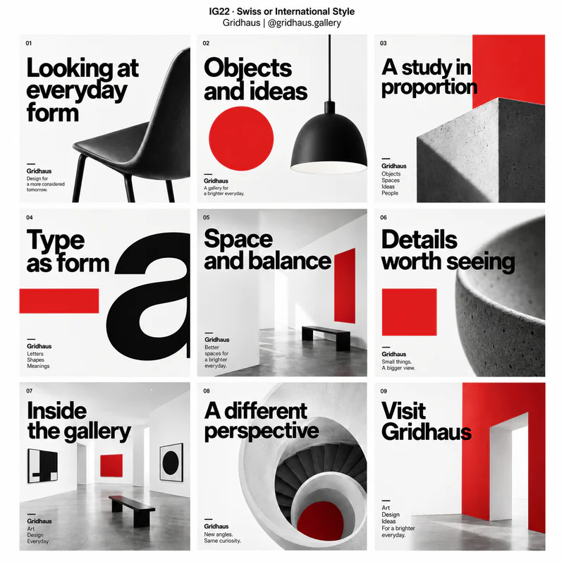 IG22
IG22Swiss or International Style
Uses rigorous alignment, clear sans-serif typography, asymmetric balance, and a disciplined underlying grid.
Best for Design institutions, cultural events, architecture, and information-heavy brand systems.
Grid details and style keywords
Gridhaus · Design gallery · @gridhaus.galleryfictional example
Align recurring elements to the same underlying grid. Use changes in scale and whitespace to structure information across slides.
- typographic grid
- asymmetric balance
- sans serif
- precise spacing
- restrained color
- 1Looking at everyday form
- 2Objects and ideas
- 3A study in proportion
- 4Type as form
- 5Space and balance
- 6Details worth seeing
- 7Inside the gallery
- 8A different perspective
- 9Visit Gridhaus
-
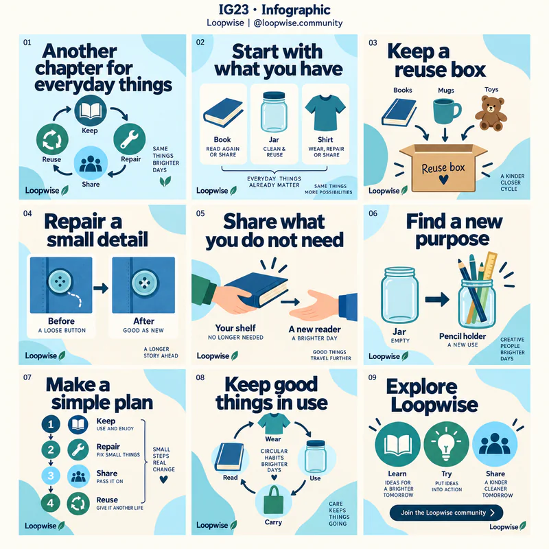 IG23
IG23Infographic
Uses simple diagrams, labeled icons, visual grouping, and clear typographic hierarchy to explain information.
Best for Educational accounts, public-interest campaigns, service explainers, and practical how-to content.
Grid details and style keywords
Loopwise · Reuse education project · @loopwise.communityfictional example
Give each slide one question or step. Use diagrams only when they clarify the message, and keep labels large enough to read.
- labeled icons
- simple diagrams
- visual grouping
- numbered steps
- clear hierarchy
- 1Another chapter for everyday things
- 2Start with what you have
- 3Keep a reuse box
- 4Repair a small detail
- 5Share what you do not need
- 6Find a new purpose
- 7Make a simple plan
- 8Keep good things in use
- 9Explore Loopwise
-
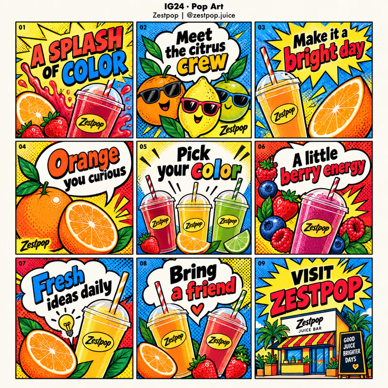 IG24
IG24Pop Art
Uses comic-inspired graphics, saturated colors, halftone dots, bold outlines, and exaggerated scale for an energetic visual style.
Best for Food and drink, entertainment, playful retail, and attention-seeking campaigns.
Grid details and style keywords
Zestpop · Juice bar · @zestpop.juicefictional example
Keep each slide focused on one bold visual or phrase. Repeat comic motifs and a controlled bright palette to hold the series together.
- halftone dots
- comic bursts
- saturated colors
- thick outlines
- oversized graphics
- 1A SPLASH OF COLOR
- 2Meet the citrus crew
- 3Make it a bright day
- 4Orange you curious
- 5Pick your color
- 6A little berry energy
- 7Fresh ideas daily
- 8Bring a friend
- 9VISIT ZESTPOP
No keyword in this pack matches that search.